Yes , Yes , people now a days live life alot faster with social media updating you every minute with news on everything you care about . Fast Food chains that are , like seriously, taking over the world. Cars that go over 160mph yet on a normal highway you're only allowed to go 60 or 70mph. What would happen if we took today's "always on the move" people and placed them back in the pioneer days. I'm talking like the Oregon Trail days, I'm sure some of you played that game in grade school. But seriously what would you do without fast cars , fast food, and fast media. How long could you survive living in the past?
Well thanks to this tutorial and Photoshop CC's new Path Blur tool. I was able to achieve this cool blur effect that goes along with the text in the photo.
After I learned how to use it and applied it to the original picture.
I added a gradient map for a cool lighting effect. Then the text was added along with a motion blur filter.
I Hope you enjoyed this blog post.Please comment below answering today's questions. It would be fun to hear your responses.Don't forget share this post with friends or other graphic designers.If you like please subscribe by E-mail and/or follow this blog so you wont miss a single post. If you want to follow me outside of this blog then please add me on Google+, Facebook, Twitter, Tumblr and/or Pintrest. If you guys have any design work that you would like me to critique or showcase on this blog than please E-mail me at SabrinaSummers2000@yahoo.com. Furthermore if you have any ideas or suggestions as to future blog posts than please comment below.
If your reading this right now than you want to be a professional graphic designer, right? Of course you do lol. I mean I've never heard of someone wanting to be a nobody in their field. No people always have that drive to become something great . They want people to shout their names. They want to be the one that everyone turns to . Well if you use these tools of the trade , in graphic design, then you'll be on the fast track to becoming a professional graphic designer!
1) A computer or Laptop
It doesn't matter if it's a Mac or PC as long as it runs the software programs you need. Sure we could get all bogged down talking about Cpus, Ram , processor speed ect. Frankly , my dear, it's up to you to choose a computer that works for you. Think of choosing a computer like buying a car or something. But if you really want to know the specs to the perfect graphic design computer than watch the video below.
2) Graphic Design software programs
There's a lot of programs out there, some are free some cost an arm , leg, and part of your bank account. Depending if you want to focus in print or online media it's important to decipher which programs you need to use. For print media , which I want to focus in, you'll mostly be using programs like Photoshop, illustrator, and/or InDesign. For web designers you guys will mostly use programs like Muse, Dreamweaver, Edge Code , Edge Inspect and many more. Dang I feel Adobe favors web designers more than print designers . Do some research to find some free alternatives to these programs. You'll be surprised at what you find !
3) Read a book!
There are hundreds of books out there that will teach you everything you need to know about graphic design , the past, the present, and the future. You can find them at your local bookstore or online like with Amazon.com
4) Do a sketch
Don't freak out! You don't have to draw like a professional ...but it's always good to carry around a sketchbook for those times you become Einstein. It's quicker and much more organic than waiting to create something on the computer.
5) Make connections
You know that saying about knowing the right people in order to succeed. Well I don't believe it's a 100% true but it 100% helps you to become better in your field. Network with other designers , show them your work and ask for a critique. professionals that have been in the field for 20 years or more know what they're talking about ! So they'll be able to give you lots of tricks and tips on how to improve your work and succeed in the field of Graphic Design.
That's it for this week's lesson Remember to always leave questions , if you have any, and share this post with friends or other newbie graphic designers. Don't forget to subscribe by E-mail or follow this blog so you wont miss a single lesson! If you want to follow me outside of this blog then please add me on Google+, Facebook, Twitter, and/or Tumblr. If you guys have any design work that you would like me to critique or showcase on this blog than please E-mail me at SabrinaSummers2000@Gmail.com. Furthermore if you have any ideas or suggestions as to future blog posts than please comment below. From Sabrina Summers with Peace and Love
These are the children of the primary colors red, blue, and yellow. You get these three colors from mixing any two of the primary colors.
You get purple from mixing Red and blue together. Purple is loving , mysterious, and seductive.
You get green from mixing yellow and blue together. Green is filled with energy and represents nature.
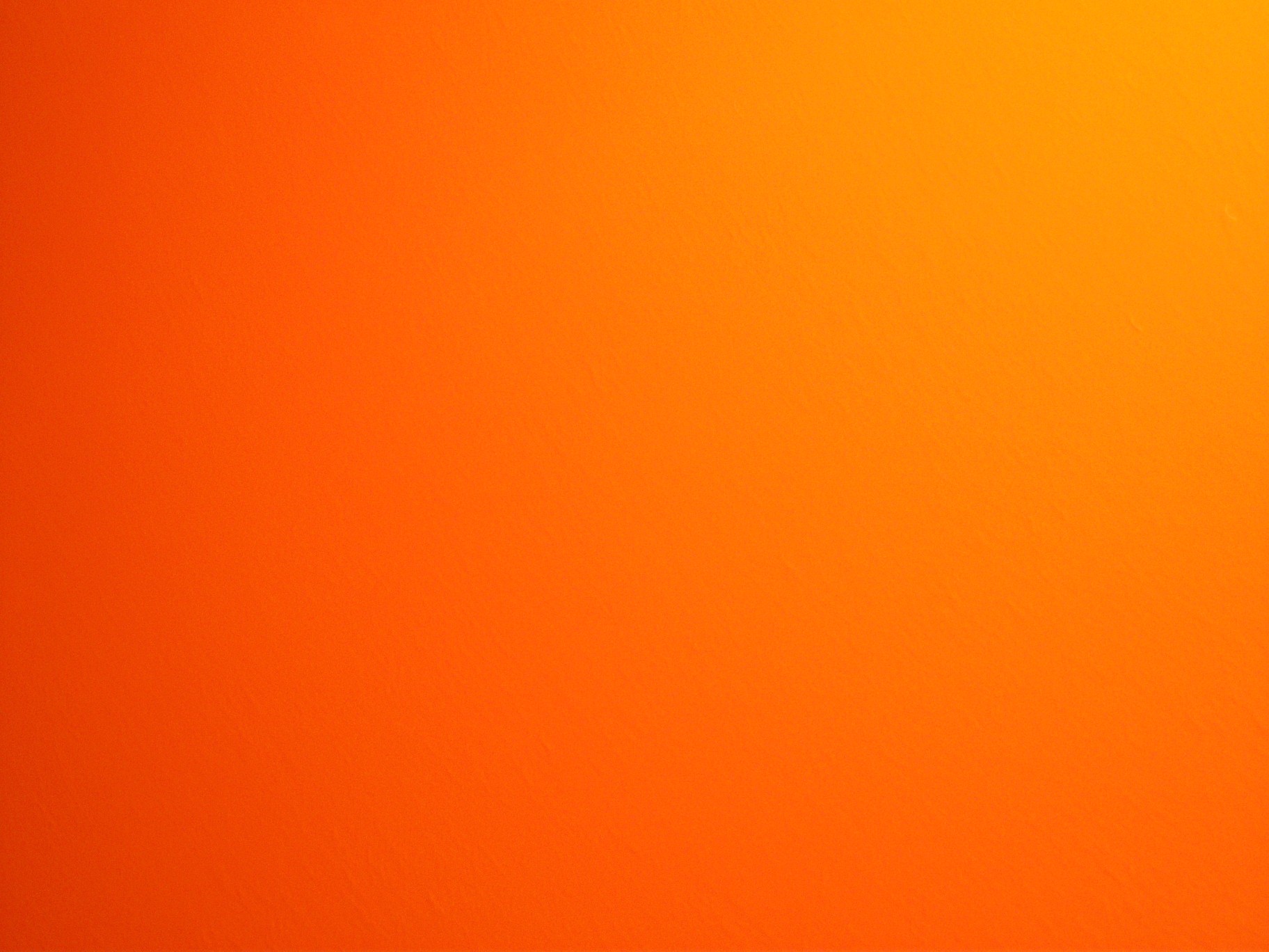
Last but not least you get orange by mixing red and yellow together. Boy , orange is an energy powerhouse that screams for your attention. No I'm not talking about the fruit .
Video:
Get Jamaican man with this silly song about secondary colors
That's it for this week's lesson Remember to always leave questions , if you have any, and share this post with friends or other newbie graphic designers. Don't forget to subscribe by E-mail or follow this blog so you wont miss a single lesson! If you want to follow me outside of this blog then please add me on Google+, Facebook, Twitter, and/or Tumblr. If you guys have any design work that you would like me to critique or showcase on this blog than please E-mail me at SabrinaSummers2000@yahoo.com. Furthermore if you have any ideas or suggestions as to future blog posts than please comment below. From Sabrina Summers with Peace and Love
Well the words speak true ya know. Sure it's a plus to look smexy hot ..but that's only your hard outer shell. Your inner beauty is your soul, your personality, your charm. All those things are what get people to like you and even fall in love with you , not your clothes , hair , and/or make-up! So what why did I make this? Just for fun you see and to hopefully send a powerful message to young women. Originally I was working on a Godzilla movie poster tutorial...but quickly got frustrated with it . Then I search for another tutorial and found this one:
Of course I made the design in my own way , using the tutorial as guidance. The author went with a beautiful yet eerie photo while I made a minimal design with the text taking center stage. So tell me , which design do you like better..mine or Abduzeedo's ? Be honest !
Here's my first ever GIF showing how I made my design ..somewhat.
Added gradient background
Added pattern
Added text
I Hope you enjoyed this blog post.Remember to always leave questions , if you have any, and share this post with friends or other graphic designers. Don't forget to subscribe by E-mail or follow this blog so you wont miss a single post. If you want to follow me outside of this blog then please add me on Google+, Facebook, Twitter, and/or Tumblr. If you guys have any design work that you would like me to critique or showcase on this blog than please E-mail me at SabrinaSummers2000@yahoo.com. Furthermore if you have any ideas or suggestions as to future blog posts than please comment below.
Yo this is so elementary , everyone should know their primary colors but nevertheless its always good to review. These are the 3 purest colors in the world meaning all other colors are created by a combination of the primary colors.So give it up for the 3 musketeers of color !
Red
Red is sexy yet dangerous .
Yellow
Yellow is all sunshine and happiness
Blue
Blue is my favorite color. It has a calming yet exciting effect.
Video:
I know it's sesame street...but the song and video are fun to watch. It also goes into next weeks post about secondary colors.
Tip: If you want your design to convey a powerful message..it's always good to use primary colors the strongest effect.
That's it for this week's lesson Remember to always leave questions , if you have any, and share this post with friends or other newbie graphic designers. Don't forget to subscribe by E-mail or follow this blog so you wont miss a single lesson! If you want to follow me outside of this blog then please add me on Google+, Facebook, Twitter, and/or Tumblr. If you guys have any design work that you would like me to critique or showcase on this blog than please E-mail me at SabrinaSummers2000@yahoo.com. Furthermore if you have any ideas or suggestions as to future blog posts than please comment below. From Sabrina Summers with Peace and Love
First off I want to say sorry for not updating you guys about me going on vacation but I'm back now ! Yayyy now on to the blog post.
Guys and Gals....you already know how to use grids ...your kinda pros at it , at least I hope so. You learned how to use grids in history, math, and most likely science class. You know how to use grids in order to gather information and measure it but ...do you know how to organize information using a grid. Today , friends, your're going to learn how what it takes to create a grid to organize text and pictures into an pleasing layout.
Photoshop has it's own grid system to help designers organize their content for websites or print design. In order to use a grid successfully you must know some basic mathematical ratios, unfortunately, like 1/2, 2/3, 3/4, 1/4 ect that's why you have to train your eye to see "sections" of the grid. Another good point to mention is that when creating a grid , keep it as simple as possible. If you create too many "sections" things can get over crowed and busy which wouldn't make a functional or eye pleasing design. Now I'm not going to teach ya about how to use ratios in your grids that's for you to figure out.
In Photoshop make a new layer, fill it with a light color, got to View-Show-Grid
Next go over the rulers and drag out some blue lines. Space those lines equally in whichever way you like. Ta Daaa You just learned how to make sections out of the grid. Let me show you some more examples.
Now all you have to do is fill in the pink space around the blue lines. Try using headlines , big pictures, and/or text to make your layout pop. Also play around and experiment with the blue lines to create a layout that's perfect for you.
Video:
That's it for this week's lesson Remember to always leave questions , if you have any, and share this post with friends or other newbie graphic designers. Don't forget to subscribe by E-mail or follow this blog so you wont miss a single lesson! If you want to follow me outside of this blog then please add me on Google+, Facebook, Twitter, and/or Tumblr. If you guys have any design work that you would like me to critique or showcase on this blog than please E-mail me at SabrinaSummers2000@yahoo.com. Furthermore if you have any ideas or suggestions as to future blog posts than please comment below. From Sabrina Summers with Peace and Love


