Translate

Tuesday, July 22, 2014

Meet the Children of the Primary Colors

Lesson # 9 : Secondary colors

These are the children of the primary colors red, blue, and yellow. You get these three colors from mixing any two of the primary colors. 

      You get purple from mixing Red and blue together. Purple is loving , mysterious, and seductive.

 You get green from mixing yellow and blue together. Green is filled with energy and represents nature.


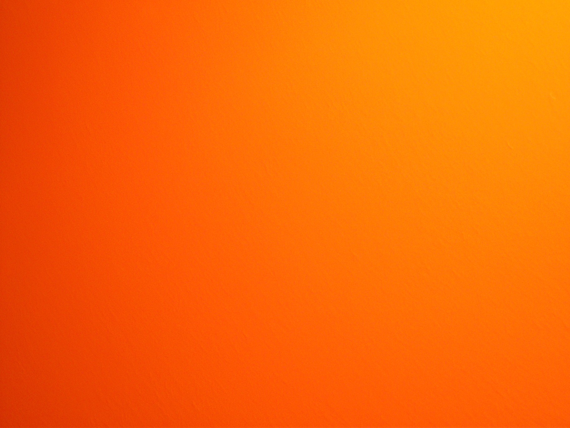
Last but not least you get orange by mixing red and yellow together. Boy , orange is an energy powerhouse  that screams for your attention. No I'm not talking about the fruit .

Video:


 Get Jamaican man with this silly song about secondary colors

That's it for this week's lesson  Remember to always leave questions , if you have any, and share this post with friends or other newbie graphic designers. Don't forget to subscribe by E-mail or follow this blog so you wont miss a single lesson! If you want to follow me outside of this blog then please add me on Google+, FacebookTwitter, and/or Tumblr. If you guys have any design work that you would like me to critique or showcase on this blog than please E-mail me at SabrinaSummers2000@yahoo.com. Furthermore if you have any ideas or suggestions as to future blog posts than please comment below.  

From Sabrina Summers with Peace and Love 

Thursday, July 17, 2014

Stop dressing like Tramps, Ladies !!!


Well the words speak true ya know. Sure it's a plus to look smexy hot ..but that's only your hard outer shell. Your inner beauty is your soul, your personality, your charm. All those things are what get people to like you and even fall in love with you , not your clothes , hair , and/or make-up! So what why did I make this? Just for fun you see and to hopefully send a powerful message to young women. Originally I was working on a Godzilla movie poster tutorial...but quickly got frustrated with it . Then I search for another tutorial and found this one:

Playing with type and images in Photoshop


Of course I made the design in my own way , using the tutorial as guidance. The author went with a beautiful yet eerie photo while I made a minimal design with the text taking center stage. So tell me , which design do you like better..mine or Abduzeedo's  ? Be honest !

Here's my first ever GIF showing how I made my design ..somewhat.


  1. Added gradient background
  2. Added pattern
  3. Added text

I Hope you enjoyed this blog post.Remember to always leave questions , if you have any, and share this post with friends or other graphic designers. Don't forget to subscribe by E-mail or follow this blog so you wont miss a single post. If you want to follow me outside of this blog then please add me on Google+, FacebookTwitter, and/or Tumblr. If you guys have any design work that you would like me to critique or showcase on this blog than please E-mail me at SabrinaSummers2000@yahoo.com. Furthermore if you have any ideas or suggestions as to future blog posts than please comment below.  

From Sabrina Summers with Peace and Love 


Sunday, July 13, 2014

The 3 musketeers of color

Lesson: 8 Primary colors

Yo this is so elementary , everyone should know their primary colors but nevertheless its always good to review. These are the 3 purest colors in the world meaning all other colors are created by a combination of the primary colors.So give it up for the 3 musketeers of color !

Red


Red is sexy yet dangerous . 
Yellow
Yellow is all sunshine and happiness
Blue
Blue is my favorite color. It has a calming yet exciting effect.


Video:

I know it's sesame street...but the song and video are fun to watch. It also goes into next weeks post about secondary colors.

Tip: If you want your design to convey a powerful message..it's always good to use primary colors the strongest effect.

That's it for this week's lesson  Remember to always leave questions , if you have any, and share this post with friends or other newbie graphic designers. Don't forget to subscribe by E-mail or follow this blog so you wont miss a single lesson! If you want to follow me outside of this blog then please add me on Google+, FacebookTwitter, and/or Tumblr. If you guys have any design work that you would like me to critique or showcase on this blog than please E-mail me at SabrinaSummers2000@yahoo.com. Furthermore if you have any ideas or suggestions as to future blog posts than please comment below.  

From Sabrina Summers with Peace and Love 


Sunday, July 6, 2014

Line up with grids

Lesson # 7: Using Grids

First off I want to say sorry for not updating you guys about me going on vacation but I'm back now ! Yayyy now on to the blog post.

Guys and Gals....you already know how to use grids ...your kinda pros at it , at least I hope so. You learned how to use grids in history, math, and most likely science class. You know how to use grids in order to gather information and measure it but ...do you know how to organize information using a grid. Today , friends, your're going to learn how what it takes to create a grid to organize text and pictures into an pleasing layout.

Photoshop has it's own grid system to help designers organize their content for websites or print design. In order to use a grid successfully you must know some basic mathematical ratios, unfortunately, like 1/2, 2/3, 3/4, 1/4 ect that's why you have to train your eye to see "sections" of the grid. Another good point to mention is that when creating a grid , keep it as simple as possible.  If you create too many "sections" things can get over crowed and busy which wouldn't make a functional or eye pleasing design. Now I'm not going to teach ya about how to use ratios in your grids that's for you to figure out. 


In Photoshop make a new layer, fill it with a light color, got to View-Show-Grid


Next go over the rulers and drag out some blue lines. Space those lines equally in whichever way you like. Ta Daaa You just learned how to make sections out of the grid. Let me show you some more examples.


 Now all you have to do is fill in the pink space around the blue lines. Try using headlines , big pictures, and/or text to make your layout pop. Also play around and experiment with the blue lines to create a layout that's perfect for you.

Video: 


That's it for this week's lesson  Remember to always leave questions , if you have any, and share this post with friends or other newbie graphic designers. Don't forget to subscribe by E-mail or follow this blog so you wont miss a single lesson! If you want to follow me outside of this blog then please add me on Google+, FacebookTwitter, and/or Tumblr. If you guys have any design work that you would like me to critique or showcase on this blog than please E-mail me at SabrinaSummers2000@yahoo.com. Furthermore if you have any ideas or suggestions as to future blog posts than please comment below.  

From Sabrina Summers with Peace and Love 


Tuesday, July 1, 2014

Shapes are Sexy

Lesson #6: Using shapes in graphic design


Shapes aren't sexy because of their form , of course you can always make them look sexy like in the picture above, but how they're used in a design. You can use shapes to help drive a message or a mood. Here are just a few basic shapes and their meaning:

Circle-

Represents: Unity, wholeness, and Infinity  

Triangle-
Represents: Things in 3s like "mind, body, and soul", "past, present, future", or " father, son, holy ghost". It's always good to use a triangle when your're trying to represent 3 different things.

Square-

Represents: Things that come in 4s like the four seasons of the year, fall, winter, spring, summer, or the four physical elements of the world , fire, water, air, and earth. A square represents tangible elements on earth.

These are just a few meanings of some basic shapes that you'll use in your ever day design work. I didn't go over all the basic shapes , because that would make this post to long haha. If you want to learn more about the meaning of shapes please check out the links below. When using shapes in your design work play around with them seeing what you make with them. In the link list below I'll include some cool tutorials on how to use shapes to build some awesome stuff . However right now it's Video time!!!! Here is an artist who uses basic shapes to create something really cool.

Speed Art "Shapes" by TacGFX


Credits:
Reference article: http://altreligion.about.com/od/symbols/ig/Geometric-Shapes/
Youtube video: https://www.youtube.com/watch?v=AKz1GuVbcBY

Tutorials:
Make a geometric pattern:  http://design.tutsplus.com/tutorials/create-a-colorful-geometric-pattern-in-photoshop--psd-37055

40 Shape tutorials using Illustrator: http://vandelaydesign.com/blog/design/illustrator-shapes-tutorials/

Photoshop shape tutorials: http://www.photoshopessentials.com/basics/shapes/

That's it for this week's lesson  Remember to always leave questions , if you have any, and share this post with friends or other newbie graphic designers. Don't forget to subscribe by E-mail or follow this blog so you wont miss a single lesson! If you want to follow me outside of this blog then please add me on Google+, FacebookTwitter, and/or Tumblr. If you guys have any design work that you would like me to critique or showcase on this blog than please E-mail me at SabrinaSummers2000@yahoo.com. Furthermore if you have any ideas or suggestions as to future blog posts than please comment below.