
Lesson # 5

#1-Balance:

Balance helps a design to look stable and in place
#2-Proximity:

This helps to create a relationship between two or more objects in a design.Proximity also helps to determine the distance between objects.
#3-alignment:

Designers use alignment in order to make the text and pictures look nice, neat, and all lined up
#4-Repetition:

Sometimes designers use repetition with text, images , or graphics to help tie the design together or they just want to repeat something over and over for the fun of it.
#5-Contrast:

When you put a dark color next to a light color your creating contrast. When you put big bulky font next to a slimmer text your creating contrast.
#6-Space:
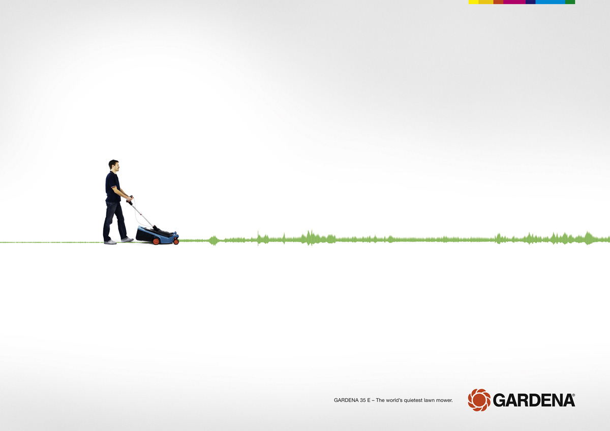
Using space is wonderful in graphic design , why? because it helps the viewer to take in the message without getting overwhelmed. In graphic design the golden rule of "Less is more" holds true!
Video of the week:
Hw: Find one example of each principle in a magazine ad or on a product in a store. Take a picture of that example and E-mail the images to SabrinaSummers2000@Gmail.com. Your images must be E-mailed by June,13th,2014.
Credits:
Youtube: https://www.youtube.com/watch?v=aflvaOH40-Y
Images: all from google
That's it for this week's lesson Remember to always leave questions , if you have any, and share this post with friends or other newbie graphic designers. Don't forget to subscribe by E-mail or follow this blog so you wont miss a single lesson! If you want to follow me outside of this blog then please add me on Google+, Facebook, Twitter, and/or Tumblr.
